Story Slam Dayton Collateral - October 2017
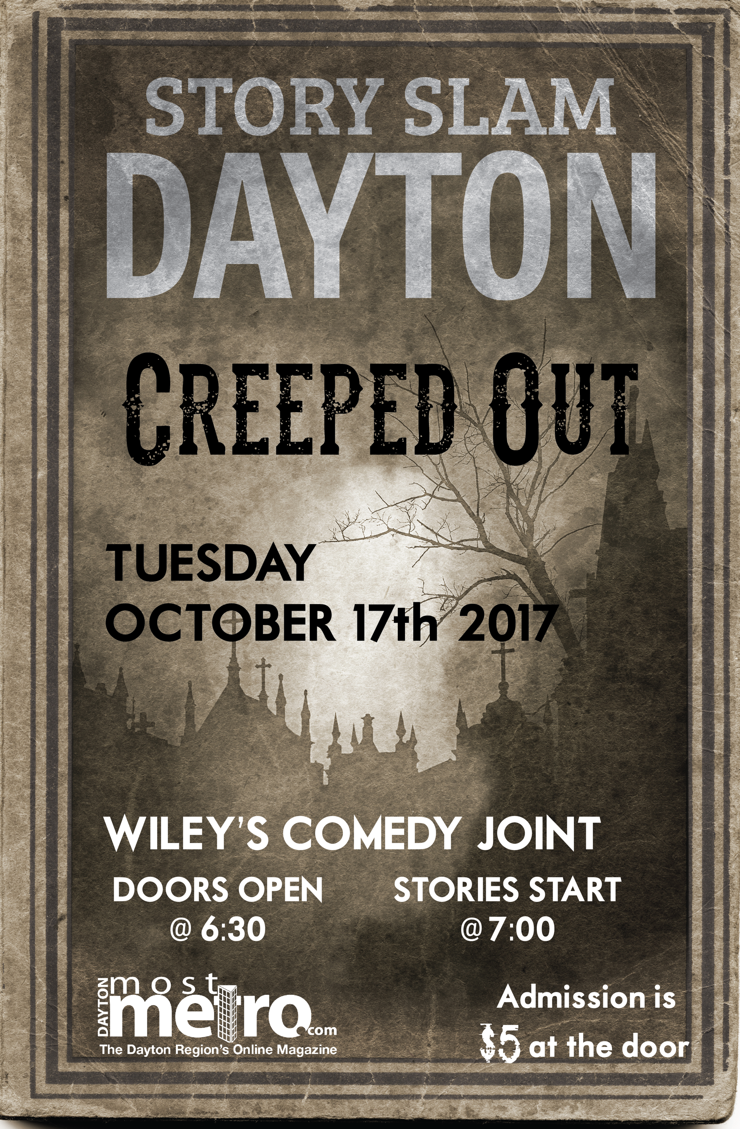
Story Slam Dayton is a storytelling event based off The Moth. Participants have five minutes to tell a true story based on the theme of the month. Every month a new theme is announced, requiring a full set of digital collateral for the event. The original concepts were based on the theme of the event, much like a theater promotes its shows. The poster is created first, then broken down into the images and information needed for Facebook and ads on local websites. Certain elements are maintained, such as the logo and the formating.
For the 2018/2019 season, we changed the overall look of the posters and the collateral, opting for a simpler look with minimal changes.

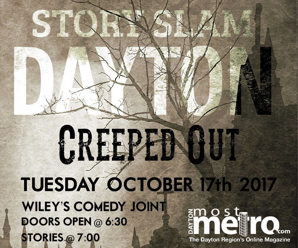
Story Slam Dayton - Square Web Ad
Web advertisement for Story Slam Dayton - October 2017. For more information about the event and concepts behind the design, please see the original poster.

Story Slam Dayton - Facebook Event Image
Facebook event image for Story Slam Dayton - October 2017. For more information about the event and concepts behind the design, please see the original poster.

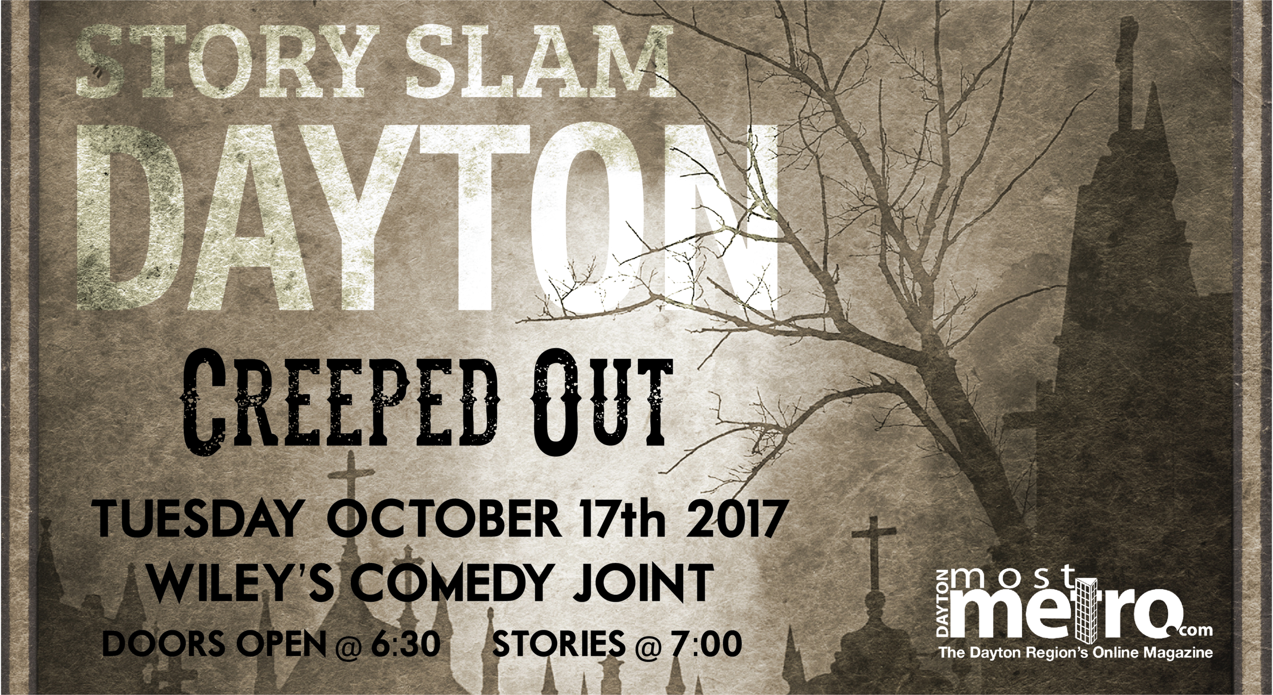
Story Slam Dayton - Facebook Cover Image
For more information about the event and concepts behind the design, please see the original poster.

Story Slam Dayton - Rectangular Web Ad
For more information about the event and concepts behind the design, please see the original poster.

Story Slam Dayton - Facebook Profile Image
For more information about the event and concepts behind the design, please see the original poster.

Story Slam Dayton - December 2017

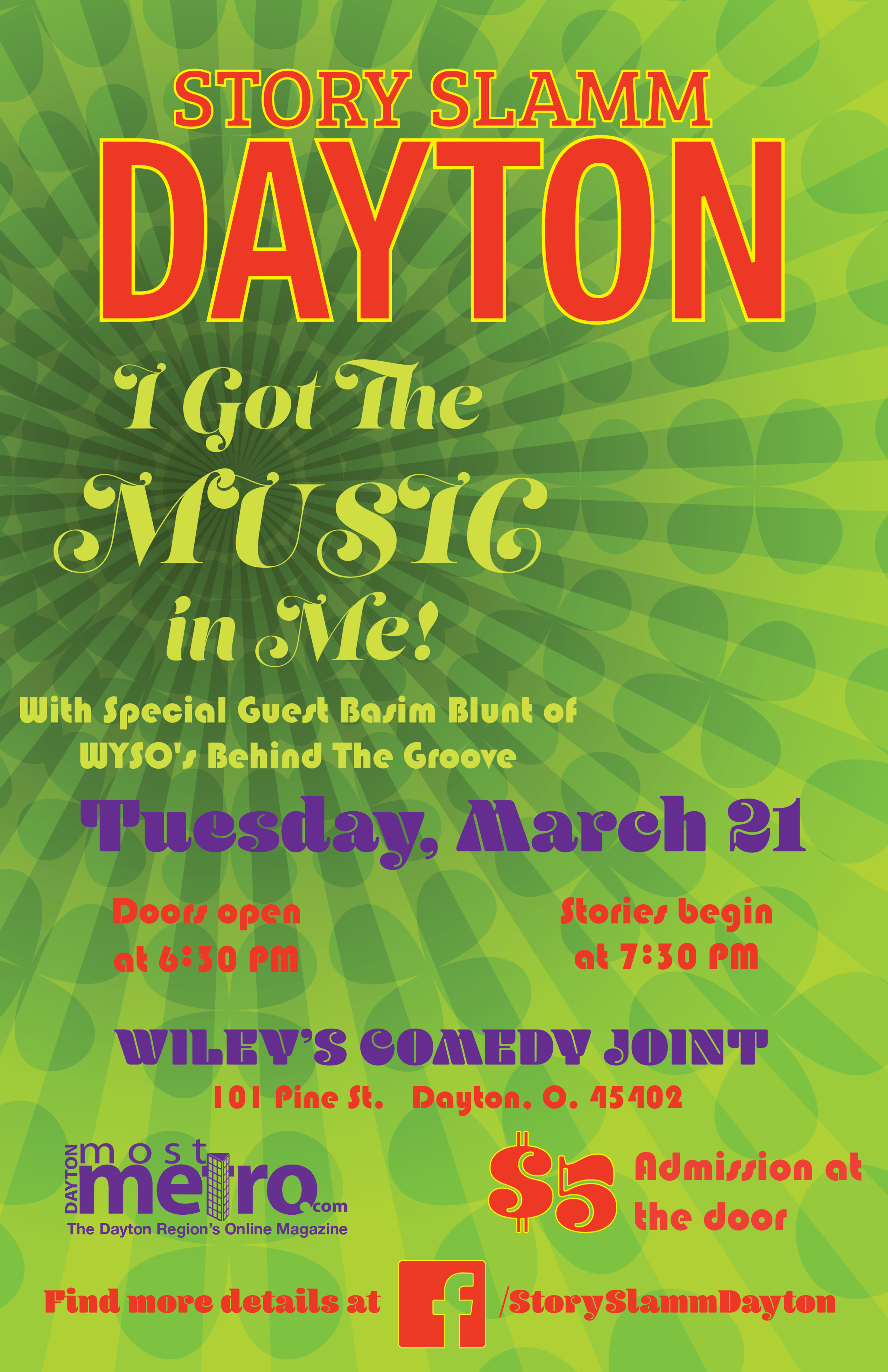
Story Slam Dayton - March 2018

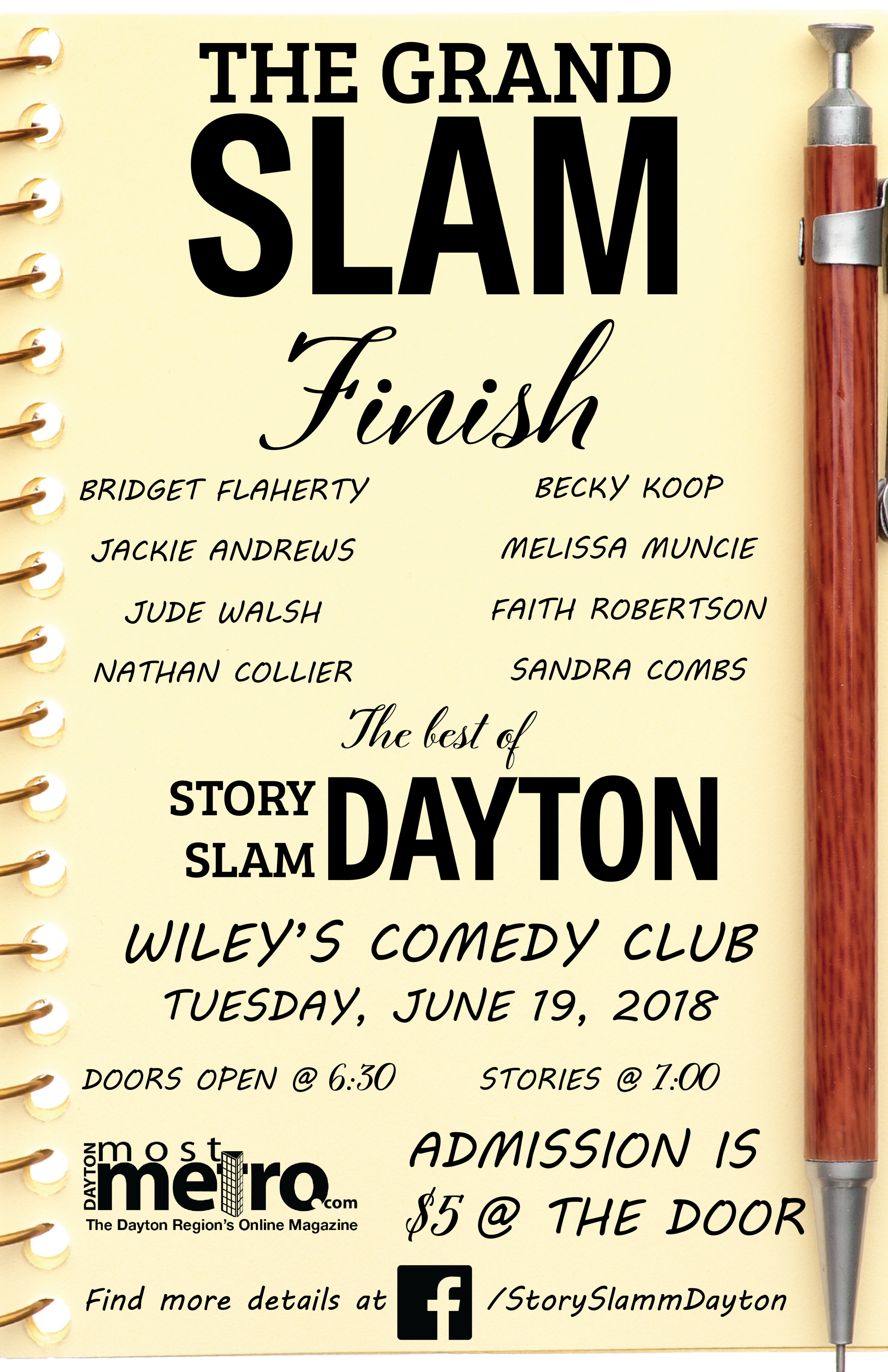
Story Slam Dayton - June 2018 - The Grand Slam
The Grand Slam has a different format than other Story Slam events, meriting a change in the layout of the poster. This is an invite-only event, where the winners of the previous Story Slams can compete for the title of being the Grand Slam champion.
This was the final poster of the previous theater-concept iterations.

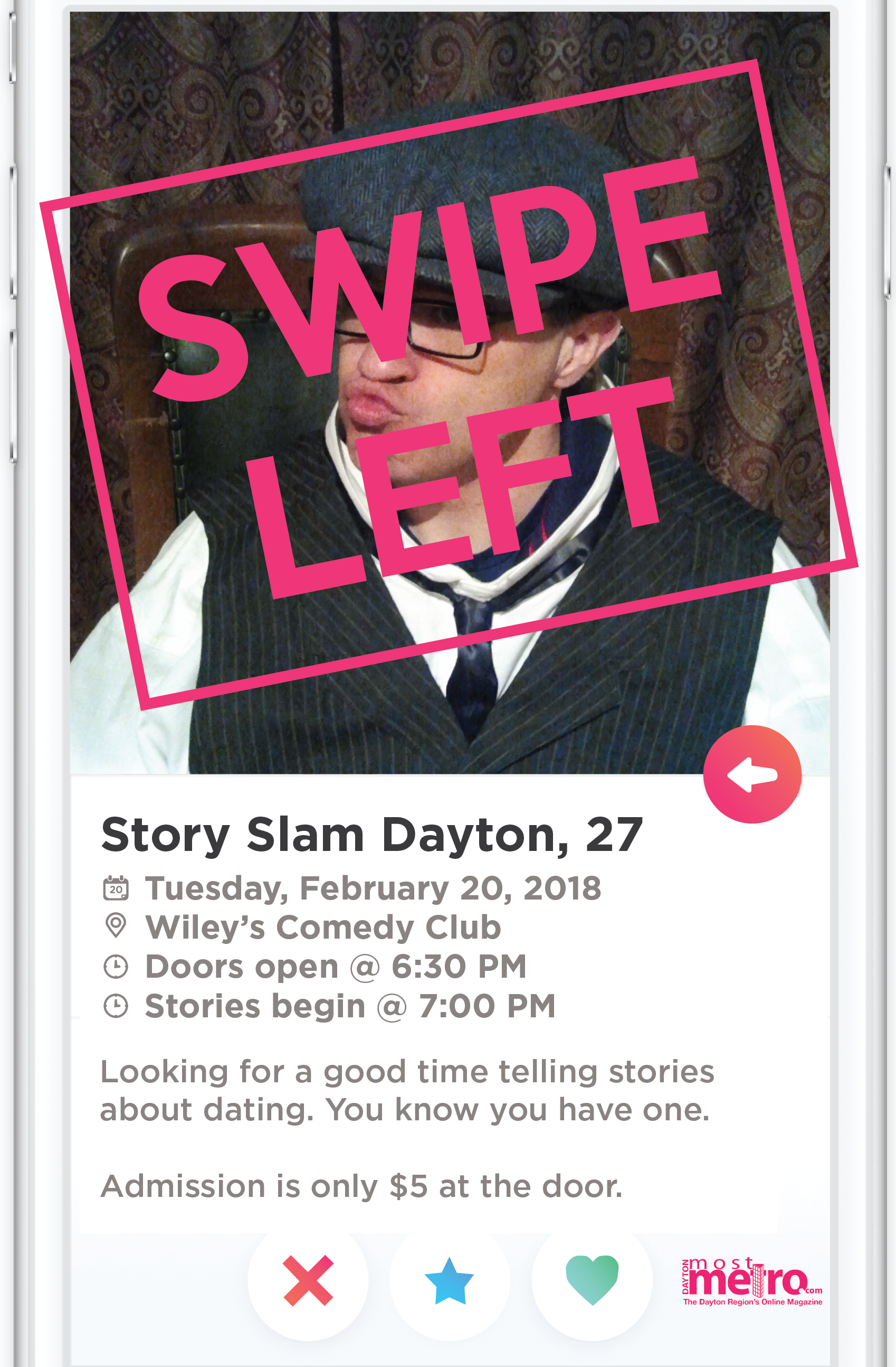
Story Slam Dayton - February 2018

Story Slam Dayton - November 2018
This is the new design direction for the 2018/2019 season. The general look stays the same, with the colors and fonts being the only changes fro month to month. It was done to give the posers a more consistent feel, establishing an always recognizable brand look for the event. The colors and fonts change with the theme.
